Monday, January 28, 2008

Baby drawings

Ah, the first 'official' drawing of Joshua J. Does it look like him? I think it does, a little bit. It has his sticky-out ears, and long sloping head. And at least it looks like a baby.

Babies are kind of hard to draw, at least for me. You either end up with the stereotypical baby that looks like every baby, or it looks way too old to be an infant.

Maybe its because infant faces just don't have many sharp angles and features to grab onto and explore in a drawing. Joshua has big brown eyes....I think I got the big and brown parts right, but I hate when I do that weird droopy eye thing. Like on his right eye (on your left) pictured here.

It happens because I get excited about making the eyes big and wide open, then forget that the bottom of the eye lid really needs to cover that a little bit. But not too much or he'll be squinty. Its a fine balance. The other eye looks pretty good though, right?

Funny....it almost resembles my brother Thain a little more than it does Joshua....see?

(He's the little guy on the right.) But then, we've already established (over Christmas) that he and Joshua were long-lost twins. Except for the big gouge in Thain's forehead.
So I guess that means it does look like Joshua! Good job, me.

Oh. And since you were wondering, yes my hair always has that disheveled look. I think there is a defunct hair gland situated just at my temples, rendering every hair that grows at that point slightly handicapped. Seriously, look at this:

This was my Sterling Scholar picture my senior year in high school. That means this picture, along with those of 12 other people, would be on display in the hallway at the school for a year. I did do my hair, really. I even borrowed someones curling iron in the bathroom before we got them taken. Not that you could tell.

And eight years later, I still had the same problem:


Though I'm sure Joseph appreciated the extra head cover in that cold Seattle December! (Kidding, kidding. Don't kill me, honey.) Hehe.

Thursday, January 24, 2008

Jane Austen

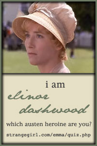
So, this Jane Austen quiz was on Heidi's blog. Those of you that are big Austen fans might enjoy it. It said I was:

I am Elinor Dashwood!


Take the Quiz here!

You are Elinor Dashwood of Sense & Sensibility! You are practical, circumspect, and discreet. Though you are tremendously sensible and allow your head to rule, you have a deep, emotional side that few people often see.

Sunday, January 20, 2008

Where is my money?

My camera is dying. Sad, but true. We bought it just under two years ago, and it has served its purpose well. Well, at least for the price we paid for it. Sometimes I miss my film SLR..which, incidentally, I still have but I never use.

While I would have liked a better camera some time ago, I have been practical and content with the one I have. But now, it has issues. Like when I was trying to take these pictures of Elora's new dress from Grandma. I had to turn on the camera three different times before the lens came all the way out, and then it was out of focus still so I had to restart it again.

The shutter speed has always been super slow (this is the most important feature to me on a new camera) but now it is maddeningly snail-paced at times. The lag time between taking pictures is too long as well.

I'm assuming that most of the problems with it are due to Elora forcing open the lens cover and sticking her finger in the lens repeatedly, but more likely they purposely manufactured the camera to fail so the consumer (me) would have to buy a new version.

While I am happy at the prospect of a new and better camera, I still have to face the fact that we are exceedingly poor students. My first plan was to win one of the contests at Pioneer Woman, where I could get a $500 dollar gift certificate for a new camera if I named one of her photos. But seeing as there are usually about 3000 entries, I figured my chances are slim in that endeavor. Yet the tax season looming before me has given me hope!

Just as I have always loved taking tests, I have learned to love doing my taxes. I know, I'm a psycho. Granted our taxes are pretty simple, as we don't have any assets or anything, but I love knowing that I figured it out myself. Well...sometimes I ask Cardine for a few tips. I also love that so far, we always get a return. Yippee! New camera for me! (and rent for the summer when we don't have student aid...)

And just like every year, I am now impatiently waiting for our W-2's to get here. I hate waiting for my W-2s.

Tuesday, January 15, 2008

Still Life

When I was much younger than today, I thought I wanted to work as a fantasy illustrator, doing book covers and Dungeons and Dragons illustrations. (I've only played the game once and didn't much care for it; the artwork was what I liked.)

I was always drawing dragons, girls and guys with swords, wizards, elves and other such stuff. I fancied that I was pretty good. When I got to high school and started taking tons of art classes, my view began to change. I became much less impressed with the book covers I used to admire, and soon developed what you might call a more refined taste in art.

True, I still fancied myself as a fantasy artist for a time. But as I attended art competitions with surrounding high schools, I found that I excelled at still lifes and landscapes. There was a yearly fantasy art contest too, but I never won a prize there until my senior year...and it was only a second place prize at that.

Now a days, I must admit I view most book cover art with distain..I suppose that is the price you pay for an education in art. And while previous posts have shown that I still dabble in fantasy-esque illustration, I have to say that I am the most proud of my pieces that stray far from that genre of art work.

For instance, while I was still single living in Seattle, I did a fun piece portraying our kitchen chairs. They were set up in the living room for a party my roommates and I were going to have, and the light hitting them from the nearby window struck me as quite beautiful.

Now, I had a hard time trying to get a good photo of this drawing (its too big for my scanner) so I will post the two best photos so you get a better idea of what it looks like:


What I like about this picture: the chairs of course! my favorites are the short chair in the center (the colors turned out really nice) and the seat just a bit closer to the viewer. I also admired the green backs of the taller chairs. Incidentally, when I got married someone gave us this same set for our kitchen.

What I don't like about this picture: the background, the green back of the closest metal frame, and the carpet. I didn't plan it out well, and hurried through it too fast. Things are spaced out poorly, the window looks really fake, and because its the brightest thing in the drawing, it draws all the attention to its imperfections. In the original setting, there was a couch in front of the window, but I took it out for aesthetic reasons.

We had stucco walls, and I didn't have the patience to figure out how to portray that on this texture of paper. I didn't like the pictures that were on the walls so I drew different ones, and its painfully obvious that they aren't real. If I were to somehow to re-do the background, this would be a fine piece.

Anyways, these are the kind of still lifes I like: portrayals of everyday things in a beautiful way. Oh yeah, paintings of industrial stuff ( gears, pipes, train yards) have a soft spot in my heart as well.

See... these were two of my favorite pieces in the last competition they had in my artist magazine:


Mickie Acierno: Number Thirty-five


Antonio Masi: Willie B.

I like these on so many levels. The first one: obviously the portrayal of light and the realism is awesome. But then there are the glowing colors, the use of repetition (notice how the orange peel is curling in the same shape as the number below it), use of the golden mein, and the overall composition. And lets face it, I'm a sucker for the color orange. However, there was another portrayal of oranges in the same issue, and I wasn't interested in that one much at all.

The second one: industrial landscapes are just...cool. Some people find them ugly, but I could stare at stuff like this for hours. There is a sense of mystery, foreboding, adventure. The composition is very nice too; excellent use of the golden mein.

If you want to see more of the stuff from this competition, head over to the Artists Magazine.
And I guess that is our art lesson for today!